Better Accessibility Through Alternative Text Validation
U.S. Department of Veterans AffairsWe updated VA.gov based on user research to create better alternative (alt) text in order to provide a more accessible experience for Veterans.

1053
Drupal Editors
573
Images uploaded per month (6 month average)
6
Mistakes prevented daily
"This is a phenomenal catch…I think something like this is a game changer.”
VA Drupal Editor
The challenge
Alternative text is a complex topic, as it is difficult to account for every possible scenario or to provide sufficient context for each image. However, in order for web pages to be the most accessible, any contextual images that have been added must include good quality, descriptive alt text. Our team was tasked with updating the image upload editorial interface within Drupal to help editors add better, more useful alt text for the images they were uploading.
We completed a full, cross-disciplinary project with our partners Friends From The City and Agile Six. The project included discovery to determine exactly which areas would be best to focus on, building a functional prototype for user research, and ultimately implementing improvements determined from that research to create a better, more informed user interface for Drupal editors.
Client goal
Our goal was to create a better alt text experience for Veterans visiting VA.gov. To achieve this we had to improve the user interface within Drupal to:
- Streamline and simplify the image upload form
- Clearly identify the alternative text field
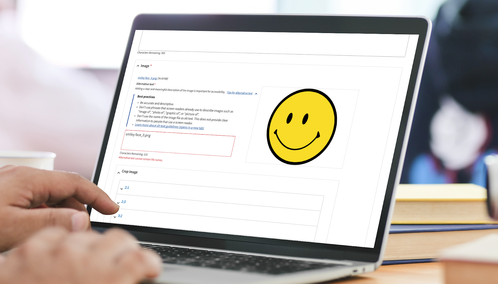
- Add client-side validation for common errors seen within existing alt text
- Provide clear and concise error messages for editors to correct mistakes
- Educate editors on how to create descriptive and accurate alt text and why it is important
Expertise
- Agile Methodologies
- User Research
- Prototype Development & Testing
- Workflow & Interaction Design
- Visual Design
- Accessibility
- Drupal Engineering
Tools and technologies
- Figma
- Mural
- Drupal
- Google Sheets
Building on Drupal, an open-source content management system (CMS), we wanted to improve the image upload editorial interface by implementing guardrails to prevent poor quality alt text through the enforcement of accessibility best practices while also reducing frustrations for CMS editors who are writing the alt text - ultimately resulting in better quality alternative text for people who rely on it to access visual content on VA.gov.
Our team worked cross functionally with our partners to explore solutions that were not only technically feasible, but also solved a variety of user needs by following human centered design practices. Research was a key component to improving the alt text on VA.gov, from gathering and analyzing statistics on current alt text to conducting user research sessions. The final design that was implemented was a direct result of iteration based on user feedback and thought partnership with our team and the product owners at the VA.
Determine which metrics to target
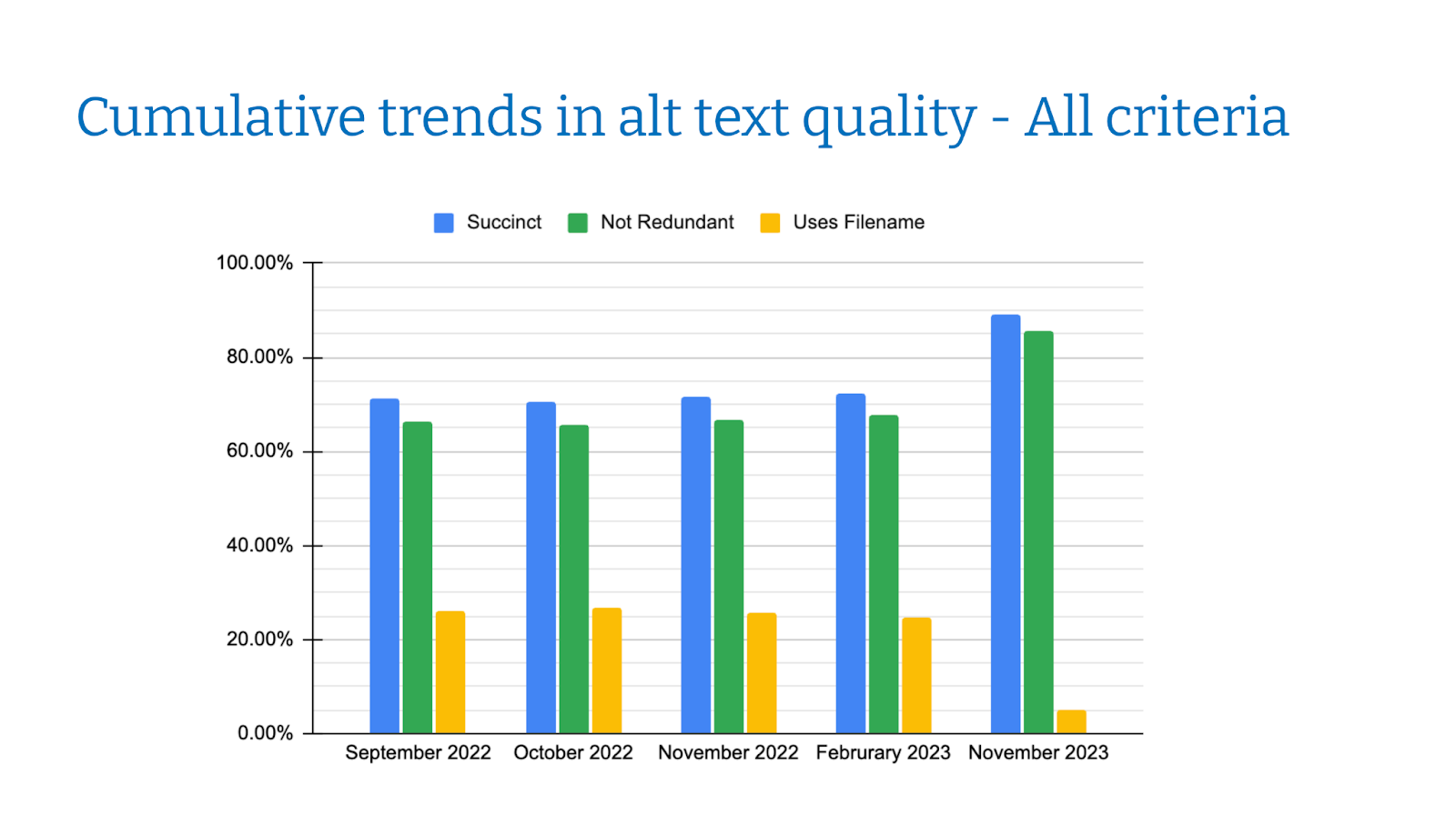
The current alt text for images within Drupal was evaluated based on multiple criteria - did the alt text contain a filename; was the alt text concise; was the alt text redundant; was the alt text accurate. The last criterion is very contextual, however the first three are more subjective and we decided to target those metrics to start focusing our improvements.

Identify Improvements
We created an interactive prototype to test with users. We analyzed the feedback from those research sessions to determine the best way to incorporate validation into the alt text field with the least amount of user disruption. We also determined additional user interface updates that would make the entire image upload experience a simpler and easier task for the editor.

Educate Drupal Editors
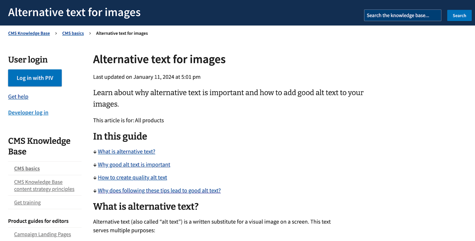
We created training articles within the Drupal Knowledge Base to help editors contextualize alt text and more fully understand what it is and why it is important. By helping editors understand the experience a Veteran might have if an image they upload has poor alt text, they will better understand the content they need to provide to improve this experience.

Key outcomes
Research-based design
We conducted research with VA.gov Drupal CMS editors to gather real data about how they upload images and interact with the alt text field. This data informed our final design decisions.
Improved editor interface
Our research found other improvements that could be made to the image upload user interface. These were small updates but resulted in a large impact to editors and greatly reduced confusion and frustration.
Immediate feedback
We added client-side validation to the alt text field, providing feedback to editors immediately when an error occurs.
Targeted training materials
Education is a large part of making accessible content. We provided resources for editors to help them understand the importance of alt text, with examples that can help them create better content for people who may have a visual disability.
Scalability
The introduction of client-side validation allows for the expansion of this feature to other input fields of the Drupal CMS with similar content quality issues.
Accessible information
VA.gov site visitors all deserve to access the information within the website. Providing better alt text allows the visual information in images to be available to those who may rely on a screen reader.

